
My Pearl Jewelry Client Case Study
My Pearl is a startup pearl jewelry company that sells quality pearls and advocates for those that want to feel confident and empowered when wearing pearls.
My Pearl's passion is to innovate outdated models of the pearl industry by daring to incorporate exquisite and superior quality pearls in all of the pieces and offer them at radically fair prices.
Problem
The current website lacks information/background about the company, the quality of the jewelry and where it's being made. Customers aren't sure if My Pearl Jewelry is trustworthy to become a loyal client.
Project Duration
6 Weeks
Responsibility
Product Designer
Team
Me & Founder
Tools
Figma, Canva, Notion,
Google Suite
Methods
Affinity Map
Competitive and Comparative Analysis
Heuristic Evaluation
User Interviews
User Flows
Personas
Wireframes
Sketches
Usability Testing
Prototype
EMPATHIZE phase was to demonstrate an understanding of my client's business goals as well as the target users and needs. I was able to identify this through competitive/comparative analysis, contextual inquiries, user interviews, and affinity mapping.
Interview Takeaways
I conducted 3 user interviews on online jewelry shoppers with the existing website, then created an affinity map to see the most common trends. The interview takeaways fell into four main sections below.
QUALITY PEARLS
Online jewelry shoppers look for quality pearls (size, metal, luster) when they are purchasing pearls.
HANDMADE JEWELRY
Online jewelry shoppers thought the website was just a basic/original company that sells pearls. And said they would be more intrigued to buy if they knew the pieces were handmade.
ACCOUNT BUTTON
Online jewelry shoppers had trouble logging in because they couldn’t find the Account button.
IMAGE QUALITY
Online jewelry shoppers had difficulty trying to see the jewelry because it was so small on the images on the mobile browser.
Current Website
-
The Account button is on the bottom left of the screen making it difficult for users to spot. This was mentioned by multiple online jewelry shoppers during the interview.
-
The current Home page does not have any information about the company or the jewelry.
-
The products on the images are too small to view.
DEFINE phase was primarily focused on identifying the main problems and target users. I wanted to make sure the design I create is aimed specifically to the right users.
How might we create the story of the brand in order to gain loyalty from customers to start shopping at My Pearl Jewelry?
How might we improve the website layout for users to quickly find the Account login page?
How might we improve the product images for better visibility?
My proposition was to design an About Us page that focused on My Pearl Jewelry's innovation, passion, and commitments to boost client buy-in and retention. And re-design the Home page and top navigation to ensure easy accessibility for users.
IDEATE phase portrays the application of the solution from the persona and user flows I created. The sketches and wireframes were the first steps before I created the first mid-fidelity prototype.
User Flow
The user flow shows how the persona (target user) would navigate on the mobile browser website, the goal is to add a piece of jewelry to cart.

Sketches
I started sketching out my ideas of what the home page, about us page, and the rest of the screens would look like below, with the idea of having the client be consistently engaged on the website, and the ultimate goal of getting their buy in.


TEST portion was the user testing of the mid-fidelity prototype. Following the feedback for design improvements, I made necessary iterations.
Usability Testing
During the usability testing, I asked all 4 participants that are online jewelry shoppers to complete 2 tasks which were to discover the story of the company and to make a purchase. These are the 4 key findings:
4/4 users were able to complete the 2 tasks successfully without any issue.
4/4 users said the About Us page had good and valuable information about the brand.
2/4 users said they wanted additional content about the brand on the home page
2/4 users said they would like an add to favorites feature.
Iterations
Original Mid-Fi Design

Revised Hi-Fi Design
CALL TO ACTION BUTTONS
User requested more information about the company on the Home page. Added content and CTA buttons for clients to explore more about the company.
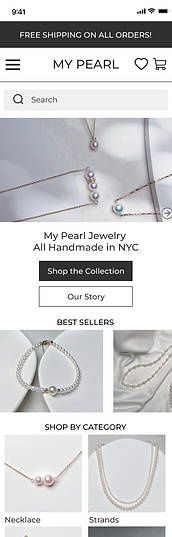
Hi-Fidelity Prototype
Final Prototype
The high fidelity My Pearl Jewelry mobile browser includes changes made from iterations in additional to including the Account login button in the menu section and the search bar right underneath. The navigation bar also includes a favorites feature.
Interactive Email Design
Before wrapping up the design iterations, one of the client's business goals was to create an email campaign to market her brand, therefore I proposed and designed a Mother's Day sale email template for her to utilize.

Summary
My client said that I surpassed their expectations by redesigning the Home page and designing an About Us page for their clients that keeps them engaged on the website; communicating the company's goals and trustworthiness in order to get their buy-in.
Retrospective
It was challenging to design the About Us page as I wasn't sure what the exact content would be on the page. After many discussions and communication with the founder, we were able to determine what the core values were for My Pearl.
If I had more time: I would continue to test with high fidelity to validate my design solutions. I would also further my research to incorporate a Reviews feature and a Pearl Education page.
After presenting the deliverables to stakeholders, I hand-off the final prototype to the CEO/Founder of My Pearl Jewelry and they have integrated My Pearl's Home Page and About Us Page. Increased conversion rate from 0.47% to 1.02%.