Wintrust Bank Case Study
Wintrust supports equity by implementing tools that empower users to gain financial literacy and accomplish their personal goals.
Wintrust is an Illinois based bank that has expanded to over 175 locations. It prides itself in providing its' customers "with the resources of a big bank while maintaining the personalized service of a true local community bank."
Problem
Customers need an efficient way to learn about financial literacy resources that are essential for making financial decisions and plans for their future, especially for those that have been historically disadvantaged.
An Overview:
Challenge
How might we empower young adults to learn more about financial literacy to make better financial decisions?
Design Hypothesis
By providing users tools such as breakdowns of their past spending and providing them guidance on simple methods of budgeting will help users gain confidence in learning more about personal finances.
Project Duration
3 Weeks
Responsibility
UX Designer & Researcher
Software
Figma, Canva, Notion, Google Drive
Collaborators
2 UX Designers
DISCOVER was our research portion. We collected data using multiple research methods, including contextual inquiries, heuristic evaluation, user interviews, affinity mapping, journey map and competitive/comparative analysis.
We interviewed 4 users, of whom 2 were adults and 2 were youths. We asked questions related to bank accounts and financial knowledge. After conducting the interviews, we created an affinity map to see the most common trends.
User Interview Takeaways
4/4 users said purpose of site is not clear
4/4 users could not open a youth account
3/4 users experienced poor information architect
4/4 users said there were features and functions users wished the website had
3/4 users learned financial literacy through parents and/or trial and error
Current Website
Wintrust’s website had poor information architecture, and lacked resources on financial literacy which gave the impression of another inefficient bank.
Journey Map
This journey map depicts what a parent who decides to setup a youth account on the current desktop site is feeling during the process.
Hopeful
Determined/Neutral
Anxiety
Frustrated/
Hopeless

DEFINE phase was primarily focused on identifying our main problems and target users. We wanted to make sure the design we create is aimed specifically to the right users.
Problems:
Adult customer needs access to financial literacy resources within her banking app so that she can better educate and support her child.
Youth customer needs access to online financial literacy tools so that he can learn to budget and manage his own money.
How might we educate our customers on financial literacy and supply the tools that a customer would need to accomplish a savings goal?
+
Our solution was to create two different portals within the same Wintrust App, one for the adult experience and the other for the youth experience. In addition, to redesigning the Wintrust desktop web for a more accessible method in signing up for a youth account.
The adult experience portal would be redesigned to include financial literacy resources for the user to access.
The youth experience portal would have a budgeting tool for the user to track expenses and save.
Adult User Persona

Nancy
Mother of two, working class.
Needs:
-
Wants to open a youth account through her current bank (WinTrust) for her 10-year-old child.
-
Wants to be able to co-manage her child’s account.
-
Wants to be able to access financial literacy resources to support herself and her child with the new account.
Frustrations:
-
Likes things to be quick and efficient.
-
Wishes she was taught about finances at an earlier age- she had to learn through trial and error.
Youth User Persona
Needs:
-
To buy a new Xbox.
-
To start a savings plan.
-
To budget and manage his own money online.
-
To learn more about financial literacy.
Frustrations:
-
Can’t seem to save money
-
Don’t know how to manage his money
-
Can’t seem to budget.

Jason
College student.
DESIGN was creating user flows, site map, sketches, and wireframes. We were able to work together on the wireframes using the data from our research and target users.
Overall Experience Mapping

Mid-Fidelity Prototype
In a week's time we went from Lo-Fi sketches to Mid-Fi prototype. Here we focused on three key features- designed around the user's pain points.
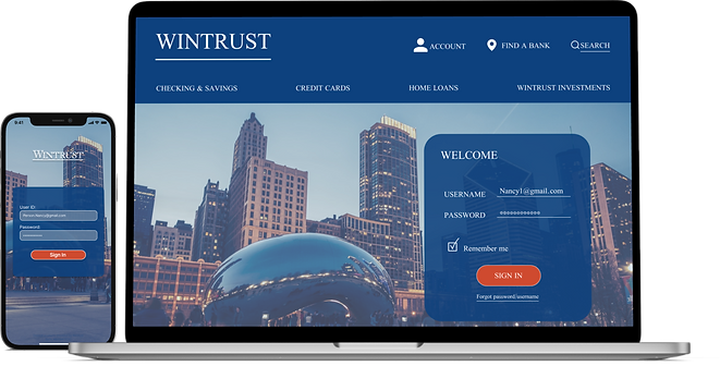
Wintrust desktop website
By redesigning the desktop site it would allow the user to easily sign up for a youth account. Therefore, they can access the mobile app as well.
Financial Literacy Tools
In our mid-fidelity app wireframes for our primary persona Nancy, we focused on the pathway that she would take to enroll in an in-person workshop.


Budgeting & Savings
In our app wireframes for our secondary persona Jason, we focused on the course he would take to create a new savings goal.
DELIVER was the prototype and testing we conducted to ensure that the final prototype was efficient.
Usability Testing
"Wow, this looks like a real app!"
One of the most important design process for us was testing out 2 users with cognitive disability. In terms of accessibility, users were able to successfully complete the task. This increased the success rate for the general population.
Number of questions asked
10
Number of Participants
(desktop, mobile)
9
Number of tasks participants were asked to finish (desktop, mobile)
4
Completion of the given tasks (desktop, mobile)
100%
Satisfaction Rate (desktop, mobile)
100%
Hi-Fidelity Overview

Launch
Sign In
Home
Financial Literacy Resources
Workshop
Budget
Savings Goal
Next Steps
-
Build out an account opening flow in-app.
-
Create an FAQ section and chat option.
-
Include educational videos and articles in the financial literacy resources.
Storyboard
